
How to Translate the Lavender Girl Summer Look into Brand Storytelling
Key Takeaways
- The Lavender Girl Summer aesthetic reflects a shift toward calm, emotional visuals that speak directly to how consumers want to feel during summer. It connects through softness, nostalgia, and mood-based imagery.
- Brands use this look to shape emotional branding, using soft palettes, light typography, and whitespace to build trust and visual clarity without overwhelming the viewer.
- Mood boards play a central role in editorial branding. They help teams organize fonts, photography, textures, and colors into a unified story that guides design decisions.
- Seasonal trends like Lavender Girl Summer offer flexible branding inspiration, letting companies stay fresh while maintaining consistency across campaigns.
- A soft, minimalist design strategy supports thoughtful messaging and design choices, allowing brands to communicate more with less through visual storytelling.
- Real and imagined examples of soft aesthetic branding that work can be found in web design, social media grids, and pastel product packaging that invites emotional connection.
Lavender Girl Summer is more than a seasonal aesthetic; it’s a visual language brands use to tell softer, more emotionally resonant stories. With its pastel palette and dreamy mood, this look creates a sense of calm and connection that speaks directly to today’s audiences.
Lavender Girl Summer is a soft, minimalist branding trend that blends feminine design with emotional storytelling to create visually compelling brand experiences. This article explores how this aesthetic shift is reshaping brand storytelling and how it can be applied to editorial design, product visuals, and seasonal marketing.
What Does the Lavender Girl Summer Trend Say About Consumer Desires?
The Lavender Girl Summer trend taps into the desire for emotional brand visuals that build a personal connection. Soft purples, sun-washed hues, and gentle textures appeal to a need for calm and control during uncertain times. It’s not just a color; it’s a signal.
Consumers want to feel something real, and visual empathy plays a significant role. These tones create a sense of safety and reflection, offering peace in a fast-paced world. Consumers associate soft, pastel branding with emotional security and self-connection.
Nostalgia as a Branding Tool
This trend leans heavily into memory. Lavender feels like summer afternoons, handwritten notes, and daydreams. Brands using these cues subtly invite consumers to recall a softer version of themselves. Through connection-based storytelling, companies can offer emotional reassurance.
When people see these visuals, they don’t just see a product; they remember a feeling. The trend is less about fashion and more about emotional needs.
Consumer emotion mapping shows that colors like lavender activate associations of warmth, innocence, and youthfulness. This is where the power lies: consumers respond best when their feelings are reflected.
Calm Branding That Builds Trust
Behind the scenes, brands are using this trend to test a calm branding strategy. It signals confidence without being loud. It feels honest. This creates space for brand authenticity, a quality that consumers demand more than perfection.
When brands choose emotional visuals carefully, they go beyond trends and tap into lasting loyalty. The Lavender Girl Summer isn’t just a seasonal vibe. It’s a reminder that emotional brand visuals that build personal connections are what people buy into. And it starts with trust, calm, and a little color.
How is the Lavender Girl Summer Aesthetic Transforming Brand Storytelling?
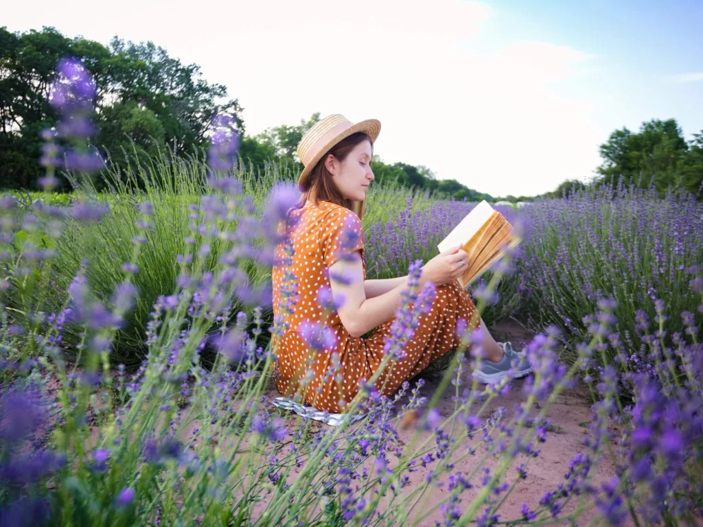
Brand storytelling’s Lavender Girl Summer aesthetic creates a quiet but clear shift. This aesthetic leans on light purples, soft lighting, and relaxed settings. It sets a mood that feels personal and unforced.
Brands using this style are leaning into mood-based visuals to tell stories that feel lived-in rather than staged. Soft, feminine visuals help brands create a sense of calm and emotional closeness with their audience.
Feminine Identity, Cultural Influence
This trend doesn’t just look pretty; it reflects more profound cultural shifts. Brands are embracing a feminine visual identity without falling into clichés. The aesthetic connects with those looking for meaning, memory, and reflection in the everyday.
It reflects a larger cultural design influence where softness is seen as strength, and nostalgia becomes part of a visual message. This invites audiences into slower stories with emotion at the center.
Strategy Through Style
The Lavender Girl Summer aesthetic in brand storytelling is a working part of an aesthetic content strategy. Instead of loud campaigns, brands are telling quiet stories that still stick. Soft visuals offer a break from the constant noise of ads. They support feelings of care, simplicity, and reflection.
This approach also fits within broader seasonal trend branding. As summer rolls in, audiences expect lighter tones, open skies, and dreamy scenes. Brands that match that seasonal energy feel more relatable and current. The style isn’t just a background; it shapes what a brand chooses to say and how it says it.
The Lavender Girl Summer aesthetic in brand storytelling shows that visuals aren’t just about looks—they shape emotion, tone, and connection. When brands adjust their look, they also reshape how they speak.
Why is Soft Minimalist Design Central to the Lavender Girl Summer Brand Look?
The soft, minimalist design for emotional branding focuses on saying more with less. Light colors, clean layouts, and gentle fonts work together to create a mood of calm and comfort.
The soft visual palette at the heart of the Lavender Girl Summer look avoids clutter and invites breathing room. The minimalist design helps brands express emotion through space, softness, and thoughtful details.
Whitespace That Connects
Whitespace isn’t blank space; it’s active space. It gives users time to pause and focus. In soft minimalist design for emotional branding, whitespace becomes a tool for expression. It removes distraction and adds emotion by letting visuals and words breathe. This approach fits with the calming user experience consumers want during overstimulating seasons like summer.
Soft pastels and minimal text don’t mute the message; they strengthen it. These emotional branding cues make every element on the page feel intentional. When used with care, they lead to brand stories that feel trustworthy and real.
Quiet Design, Strong Impact
The Lavender Girl Summer aesthetic doesn’t shout. It whispers with style. Brands using this approach are building a quiet design strategy that feels human. The layout is relaxed, and the tone is thoughtful. Instead of bright, busy graphics, it favors soft gradients and simple icons.
This approach supports whitespace in design as a tool for emotion, not just structure. It shows that clean doesn’t mean cold; it means clear. When brands choose this soft aesthetic, they build warmth through elegance. The smooth, minimalist design for emotional branding proves that the design can be calm and still carry meaning. It’s a choice to slow down and let the message breathe.
How Do Mood Boards Bring the Lavender Girl Summer Aesthetic into Editorial Branding?
Using mood boards for editorial branding helps turn abstract feelings into concrete visuals. Mood boards act as filters for the Lavender Girl Summer aesthetic, pulling together soft tones, gentle textures, and feminine images into one place.
This is part of the design development process, where brands make visual choices that reflect emotion and tone. Mood boards help editors and designers align tone, texture, and typography before starting any layout.
Fonts, Textures, and More
This aesthetic leans on airy fonts, subtle grain, and light-filtered photos. Mood boards bring all of that together in one view. When working with branding kits or creating a visual library, it’s easier to shape consistency by seeing how everything fits. Fonts with soft curves, linen-like backgrounds, and light lavender hues work together to shape the whole picture.
Moodboard layout examples often place photography next to typography and color swatches. This helps creatives test different looks before they commit to a style.
Editorial Direction Made Clear
Using mood boards clarifies the editorial direction of a project. Everyone involved, including writers, designers, and marketers, can see the vibe. It creates an emotional checkpoint. For something as sensory as the Lavender Girl Summer look, this matters. It’s how tone and texture become tools for brand storytelling.
Visual planning tools like mood boards make building a feeling across an entire brand easier. They offer a starting point that’s both strategic and creative. Knowing how to use mood boards for editorial branding gives you more than a look. This gives you a shared language.
How Can Seasonal Trends Like Lavender Girl Summer Inspire Visual Storytelling?
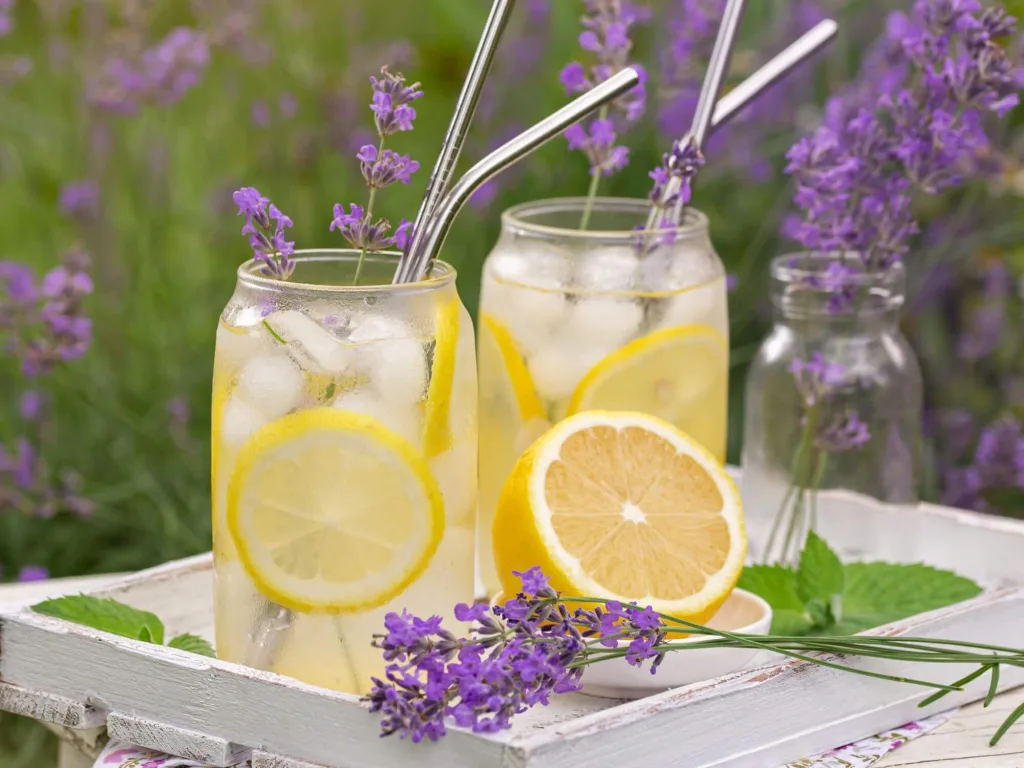
Visual storytelling inspired by seasonal trends helps brands stay current without chasing every fad. The Lavender Girl Summer aesthetic offers a perfect seasonal moment to connect with the audience’s emotions. Soft colors, slow pacing, and nostalgia align with summer’s natural vibe. Seasonal trends give brands a creative way to stay timely while still feeling consistent.
Aesthetic Meets Planning
Brands need a clear plan to make seasonal visuals work. A seasonal content calendar allows teams to map campaigns around the energy of each season. Lavender Girl Summer fits into summer’s calm and dreamy feeling, making it perfect for storytelling that invites rest and self-reflection.
With this plan in place, marketers can create authentic trend-based storytelling. Instead of pushing products, the focus shifts to mood, tone, and lifestyle, keeping the audience engaged and making content more memorable.
Staying Cohesive with Trends
Some trends fade fast, but others, like Lavender Girl Summer, fit well into cyclical brand visuals. These recurring looks help brands maintain a fresh image without starting from scratch. By pulling from aesthetic marketing trends, teams can refresh their branding while preserving core values and identity.
This approach also supports better cultural timing. Using the right aesthetic at the right time shows that a brand is paying attention and in touch. It helps create campaigns that feel alive and current.
When brands use visual storytelling inspired by seasonal trends, they shape stronger emotional stories. These visuals connect with the audience’s feelings and seasonal rhythms, making the message seen and felt.
What Are Examples of Lavender Girl Summer Branding That Work?
The best examples of soft aesthetic branding are those that work to create a feeling before a product. Think of a website that opens with a lavender haze, soft scroll animations, and airy serif fonts. These elements aren’t just pretty; they guide mood and behavior.
This is how the Lavender Girl Summer aesthetic builds trust through tone. Brands that use soft visuals and clean layouts can create a sense of calm, care, and connection.
Instagram That Tells a Story
On social media, the aesthetic thrives. Brands using Instagram grid aesthetics often pair pastel photos with minimal text, natural lighting, and curated lifestyle shots. It feels like a visual diary instead of a product pitch. Beauty and skincare brands do this well by blending product close-ups with flowers, sun rays, and handwritten captions. This builds identity without shouting.
The soft aesthetic also supports digital brand storytelling. It allows brands to slow down and highlight moments, not just items. The grid becomes a place for storytelling, not selling.
Packaging That Gets Picked
Pastel packaging has become a fast favorite for brands that want to stand out by being subtle. A makeup brand using soft lavender tones, recyclable matte paper, and tiny serif text instantly taps into a relaxed, feminine vibe. This packaging is a cue for the buyer; it’s quiet but deeply appealing.
Whether it’s a landing page or a lip balm box, these examples of soft aesthetic branding that work show that emotion can live in design. They offer real branding inspiration for those building brands that want to feel like memories, not ads.
Why the Lavender Girl Summer Aesthetic Matters for Brands
The Lavender Girl Summer trend is more than a seasonal look. It reflects how consumers respond to calm, soft visuals and emotional storytelling. Brands that use this aesthetic signal a thoughtful, personal tone. The trend shapes branding choices across platforms, from mood boards and minimalist layouts to pastel packaging and seasonal campaigns. Lavender Girl Summer visuals help brands connect emotionally while staying current with cultural moments.
This aesthetic also proves that quiet design can speak loudly. It supports brand cohesion, offers visual consistency, and creates space for reflection. The trend fits naturally into seasonal branding cycles and lets companies stay relevant without losing their voice. The Lavender Girl Summer style offers direction, whether building a social feed, shaping an editorial layout, or updating a product’s look. It shows how softness, mood, and timing can transform design into fresh and personal storytelling.
FAQs
What is the Lavender Girl Summer aesthetic in branding?
The Lavender Girl Summer aesthetic features soft colors, minimalist design, nostalgic themes, and a calm, emotional tone. It creates a gentleness and warmth that connects with consumers during seasonal campaigns, especially in summer.
Why are soft visuals important in emotional branding?
Soft visuals like calm colors, whitespace, and straightforward typography help build emotional connections. These elements support thoughtful and relatable storytelling, not overwhelming or sales-driven.
How can brands use mood boards to apply this aesthetic?
Mood boards organize fonts, imagery, colors, and textures in one place. They support editorial direction by offering a visual reference that aligns the entire team. This is helpful for campaigns that need consistency across platforms.
What makes soft minimalist design effective for branding?
It reduces clutter and puts focus on emotional tone. Clean layouts, gentle curves, and whitespace allow messages to breathe, making the design feel calm and intentional rather than busy or forced.
Can seasonal trends like Lavender Girl Summer still feel authentic?
Yes. Trends like this work when they align with the brand’s voice and audience expectations. Visual storytelling inspired by seasonal trends allows brands to stay timely while reinforcing their core identity


